
The Dot-Com Era Looked Different
One chart gives some serious context.

If you’re like me, you see a solid amount of doom and gloom. It feels like people want to see the stock market fall.
As if they believe they are deserving of a bear market… almost guilty for having been able to participate in a bull market.
As you all know, I cannot time markets. Nor do I try. But there has been no shortage of doomer takes as we entered 2026.
Here, look for yourself. All you have to do is type in “dot com market” into Google and you’ll be met with a few of these search results.

Call me naive, but from what I have learned, the Dot-Com bubble was fueled by severe speculation. Companies that didn’t even really do anything could go parabolic at any point in time just by adding “.com” to their name.
Does that seem like today? To me, it does not.
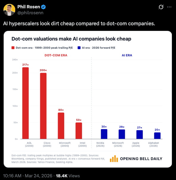
I don’t think that any chart better explains my feelings than the one Phil Rosen posted to X. Phil is the co-founder of Opening Bell Daily. His work is impressive; I read it each morning and highly encourage those who are market-focused to check it out.
Phil’s chart shows the difference in valuation of key companies during the Dot-Com Era and the AI Era.
For reference, a P/E ratio, or price to earnings ratio, is generally used to value a company. While many factors go into analyzing a company, the P/E ratio is a quick way to understand the price of a company’s stock divided by its earnings per share.
At a very high level, the lower the P/E ratio, the more value an investor is getting per dollar paid for the stock. Please take this with a grain of salt. Security analysis goes much further than just one ratio.
But what the chart shows are absolute blowout trailing P/E ratios during the Dot-Com bubble. Microsoft was trading at 80x earnings! Said differently, for every $1 of earnings the company posted, investors were willing to pay $80.
Even the hyper-scalers of today, such as Nvidia, are only trading at 30x earnings.
One quick note: The figures shown for the Dot-Com Era are a trailing P/E ratio, meaning those earnings did materialize. For the current day ratios, a forward P/E ratio is used, meaning these are projected earnings and could be subject to change.
I’m not telling anyone which stocks I believe are undervalued or overvalued. All I’m saying is that Phil’s chart adds a ton of context to what a bubble might entail.
To me, it seems that there are fundamental drivers of this market, such as earnings expansion.
After reviewing it, it is hard for me to believe we are currently experiencing a Dot-Com era bubble. But that’s just me…
Do you think differently? Do you have evidence that contradicts my piece today? If so, please send it my way. I love to hear different opinions from readers.
One of my New Year’s Resolutions was to constantly challenge my existing beliefs! Help me make good on that resolution!
This is for informational purposes only and is not intended as legal, tax, or investment advice or a recommendation of any particular security or strategy. The investment strategy and themes discussed herein may be unsuitable for investors depending on their specific investment objectives and financial situation. Opinions expressed in this commentary reflect subjective judgments of the author based on conditions at the time of publication and are subject to change without notice. Past performance is not indicative of future results.